SaaS
Design System for an HR Platform
Built by Denise Quintos
Built and shipped the component library and design foundations for an HR software team's product surfaces.
Builder email verified
Verification
- Type
- Professional
- Category
- SaaS
- Published
- Jul 25, 2026
- Updated
- Jul 25, 2026
About this project
- The problem
The product had grown across four squads with no shared foundations, so there were eleven button variants, three date pickers that behaved differently, and a colour palette that had drifted far enough that two screens side by side looked like different products. Designers were rebuilding the same components in Figma every sprint and engineers were reimplementing them, which was slow and produced inconsistencies customers noticed — support tickets about not being able to find a control were a recurring category. The team wanted a shared library, and I wanted the accessibility problems fixed on the way through, since several components failed contrast requirements outright.
- My role
I was the designer on a two-person effort with a frontend engineer, alongside my normal squad work for the first four months, which is why it took longer than planned. I owned the design side entirely — the audit, the foundations, the component specifications and the Figma library — and wrote a meaningful share of the React implementations myself for the simpler components. I also ran the adoption sessions with the other squads, which was where the project was actually won or lost.
- What I owned
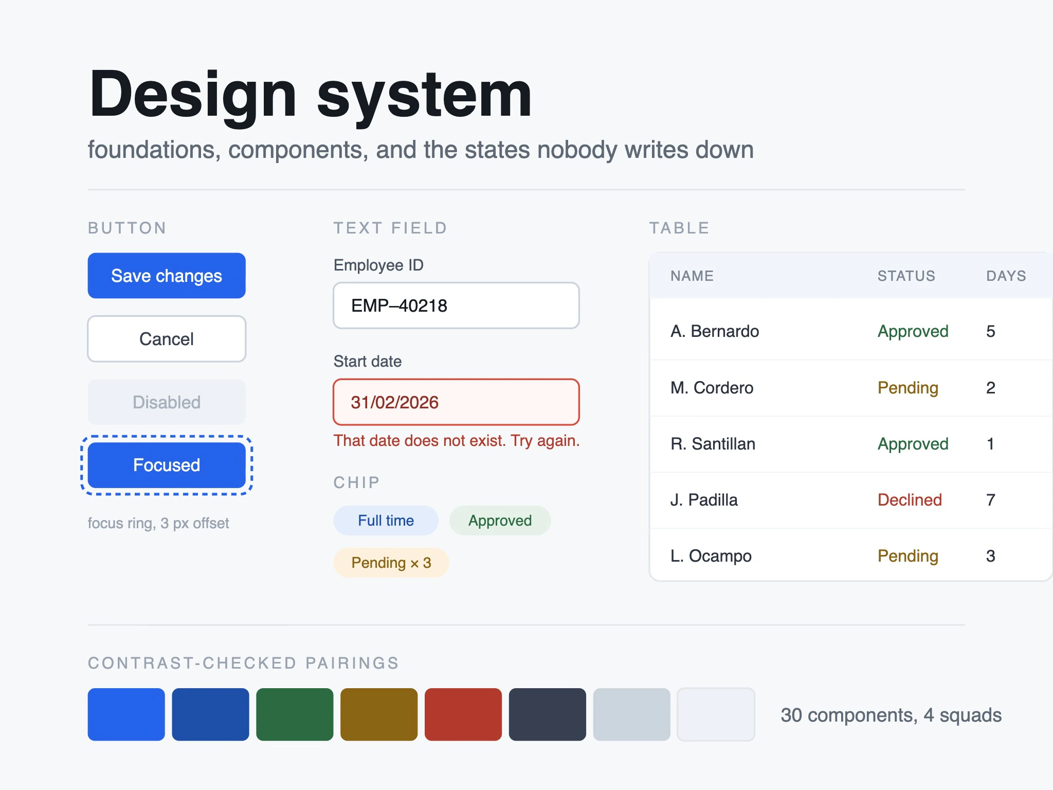
I did the audit of every existing surface, which found around two hundred distinct component instances collapsing to about thirty real components. I defined the foundations — type scale, spacing, colour with contrast-checked pairings, focus and error states — and specified each component including its states and keyboard behaviour, which had never been written down. I built the Figma library and kept it in step with the code. I wrote the implementations for the form controls, tables and empty states; my engineering partner did the complex ones. I owned the documentation site and the migration guidance per squad.
- Technical & product decisions
The decision that made it work was building on an unstyled accessible component primitive layer rather than writing behaviour ourselves. I'd wanted to build from scratch — it's more interesting — and my engineering partner argued that we'd spend our whole budget reimplementing focus traps and combobox keyboard handling badly. He was right, and it let us spend our time on the parts specific to our product. I also decided against a theming layer, which product management wanted for a possible white-label future that had no committed customer; it would have doubled the token work for a maybe. And I insisted every component ship with its contrast pairings fixed rather than porting the old palette forward, which meant a visible colour change customers noticed and one uncomfortable meeting.
- Constraints
Nobody was full-time on it, so it was squeezed alongside roadmap work for most of its life. We couldn't ask squads to stop and migrate, so adoption had to be incremental and both systems coexisted for about eight months, which meant deliberately making the new components droppable into old screens. There were also two legacy surfaces on an older framework that we agreed upfront would never migrate, and marking them out of scope early stopped a lot of pointless debate.
- Result & impact
Component reimplementation stopped being sprint work — the squads' own estimates put common screen build time down by roughly half, and I'd treat that as directional rather than precise. Every component in the library meets the contrast requirements now, against about a third of the old ones failing, and the keyboard navigation issues that had been an open accessibility finding for over a year were closed. Three of four squads reached full adoption within about ten months. Support tickets in the can't-find-the-control category dropped enough that our support lead mentioned it unprompted, which meant more to me than the build time number.
- Who else worked on it
My engineering partner built the complex components and set up the library tooling, and vetoed two of my ideas in ways that made the system better. A designer from another squad reviewed every specification and caught the cases where I'd designed for my squad's screens only. Our support lead gave me the ticket categories that told me where the real confusion was, which is how the empty states and error messages got prioritised over things that would have looked better in a portfolio.