Developer Tools
Pairwise
Built by Denise Quintos
A small tool for finding accessible colour pairs, built because contrast checkers tell you what fails and not what to use instead.
Builder email verified
Verification
- Type
- Personal
- Category
- Developer Tools
- Published
- Jul 25, 2026
- Updated
- Jul 25, 2026
About this project
- What I built & why
During the design system work I spent an unreasonable amount of time in contrast checkers, and every one of them does the same thing: you paste two colours, it says fail, and you go away and guess again. What I actually needed was for it to keep the colour I care about and show me the nearest acceptable version of the other one, along with a few alternatives that stay in the same family. I built it in about three weekends because I was tired of the guessing, and I've kept it up since because I use it every week.
- The problem
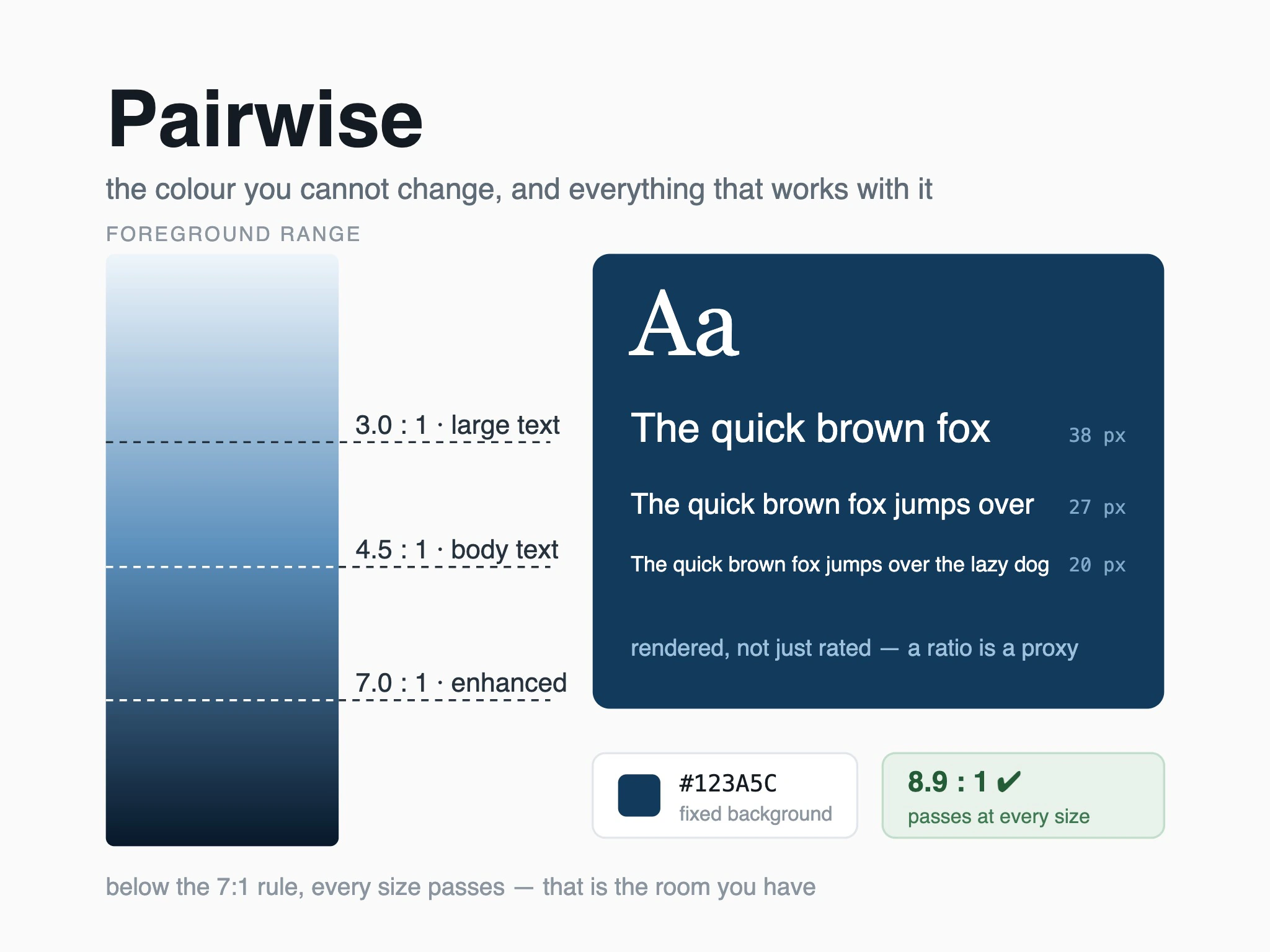
It solves the step after the check. You give it a fixed colour — usually a brand colour you can't change — and it shows you the range of foreground or background colours that pass at each contrast level, laid out so you can see how much room you have rather than testing one candidate at a time. It also shows the pair at realistic text sizes, because a ratio that technically passes can still be unreadable at 12 pixels. It's for designers and frontend developers doing exactly what I was doing, and it does nothing else.
- What I owned
All of it. The contrast maths, the colour space work for generating candidates that stay perceptually related to the original, the interface, and the deployment. The part I'm actually proud of is the layout of the results: an early version showed a list of hex codes, which is technically the same information and useless, and the version that works shows a continuous ramp with the passing thresholds marked, so you can see immediately whether you have lots of room or almost none. I also wrote the tests for the maths, since being wrong here would be worse than not existing.
- Technical & product decisions
I generate candidate colours by moving through a perceptually uniform colour space rather than adjusting hex values directly, because naive lightness adjustments shift hue in ways that look wrong even when the numbers pass. That was the difference between suggestions a designer would accept and suggestions they'd reject on sight. I show the pair rendered as actual text at several sizes and weights instead of just a ratio number, since the ratio is a proxy and the rendering is the thing you're deciding about. I also deliberately included the level that only large text passes, clearly labelled — some checkers hide it, and pretending the distinction doesn't exist just pushes people to ignore the tool.
- Hardest challenge
Getting the perceptual colour work right was beyond what I knew when I started and I got it wrong twice. My first version adjusted lightness in HSL, and the greens came out looking sickly while the blues barely moved — mathematically fine, visually unusable. Reading enough colour science to understand why took longer than building the tool. What fixed it was moving to a perceptual space for the adjustment and clamping the results back into displayable range carefully, rather than letting values clip, which is what was causing the worst of the shifts. I still don't fully understand the edge cases and I've written that on the page.
- Result & impact
My whole design team uses it, which is eight people, and it's linked from our internal accessibility documentation. Outside that maybe a few hundred people have found it — it got shared in a design newsletter once and the traffic has never gone back to zero. It saved me real time on the design system: the colour pairings I had to fix went from a week of guessing to about a day. Two people have written to me about edge cases in the maths and one of them was right, which is the most useful feedback I've had on anything I've built.
- Who else worked on it
My engineering partner from the design system work reviewed the contrast maths and found that I was rounding at the wrong point, which shifted results near the threshold — exactly where it matters. A colleague who uses a screen reader tried the interface and pointed out that a tool about accessibility had an unlabelled slider, which was embarrassing and took ten minutes to fix. The stranger who wrote in about the clipping edge case effectively did a code review for free, and their example is now a test case.